- Fonts
- Music
- Graphic Arts
- Drawings & Paintings
- Design
- Exhibitions
Welcome to my website. You can see a selection of freelanced and custom artwork here. My studio is a world of painting, drawing, graphics, music, illustration, typography and design, individual genres intertwine and overlap in various ways. If you are interested in my work, write to me at frantastorm@gmail.com
No content from this website may be copied without the permission of the author.

Rock&All - logo and concept of typographyDesign
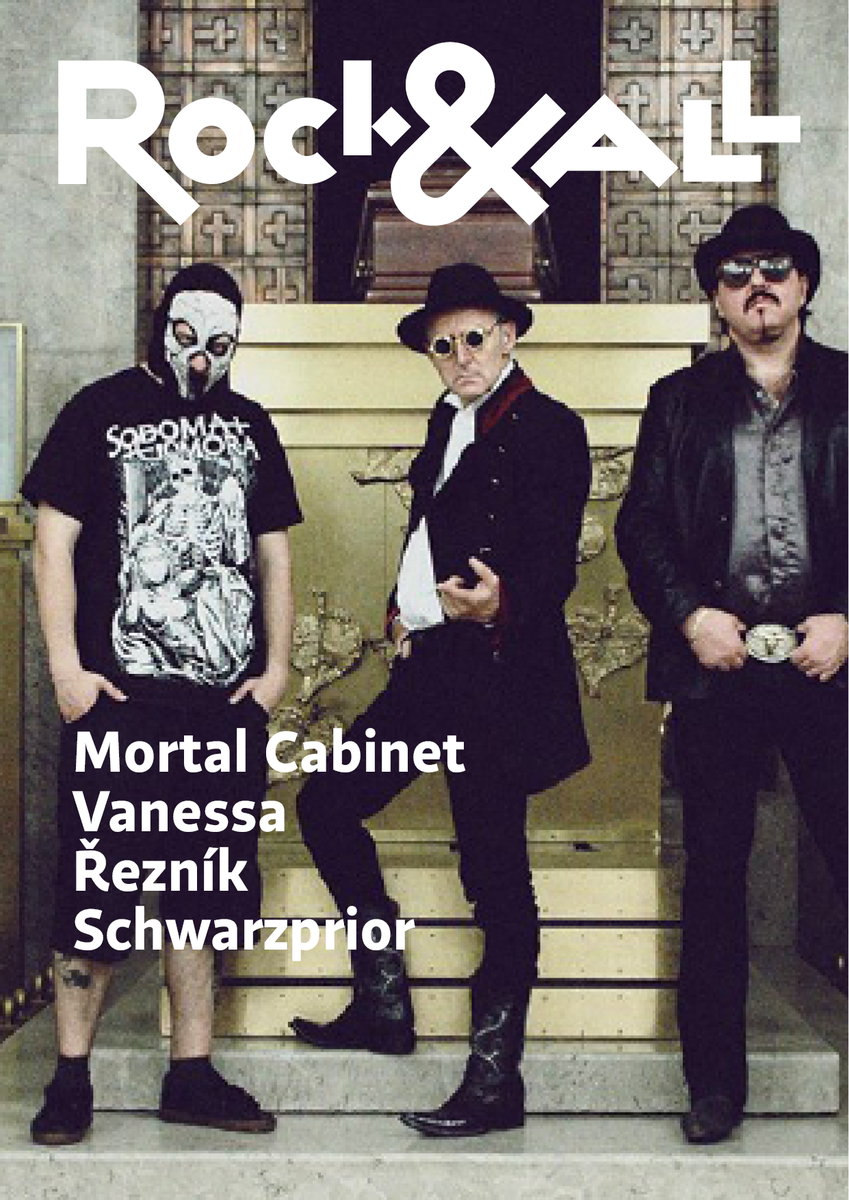
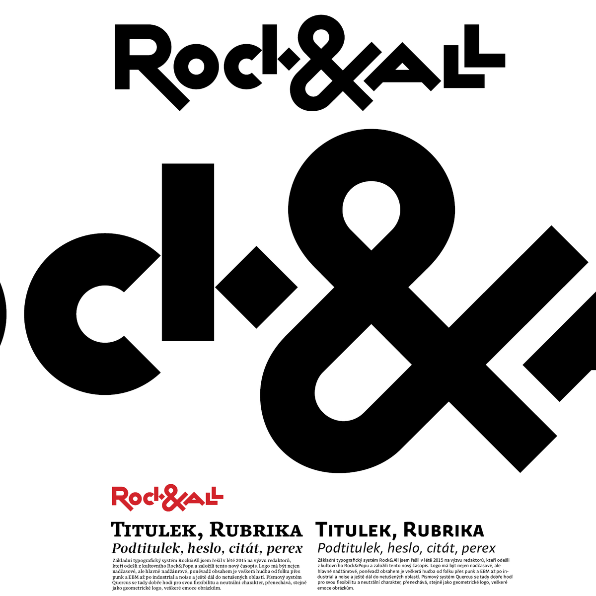
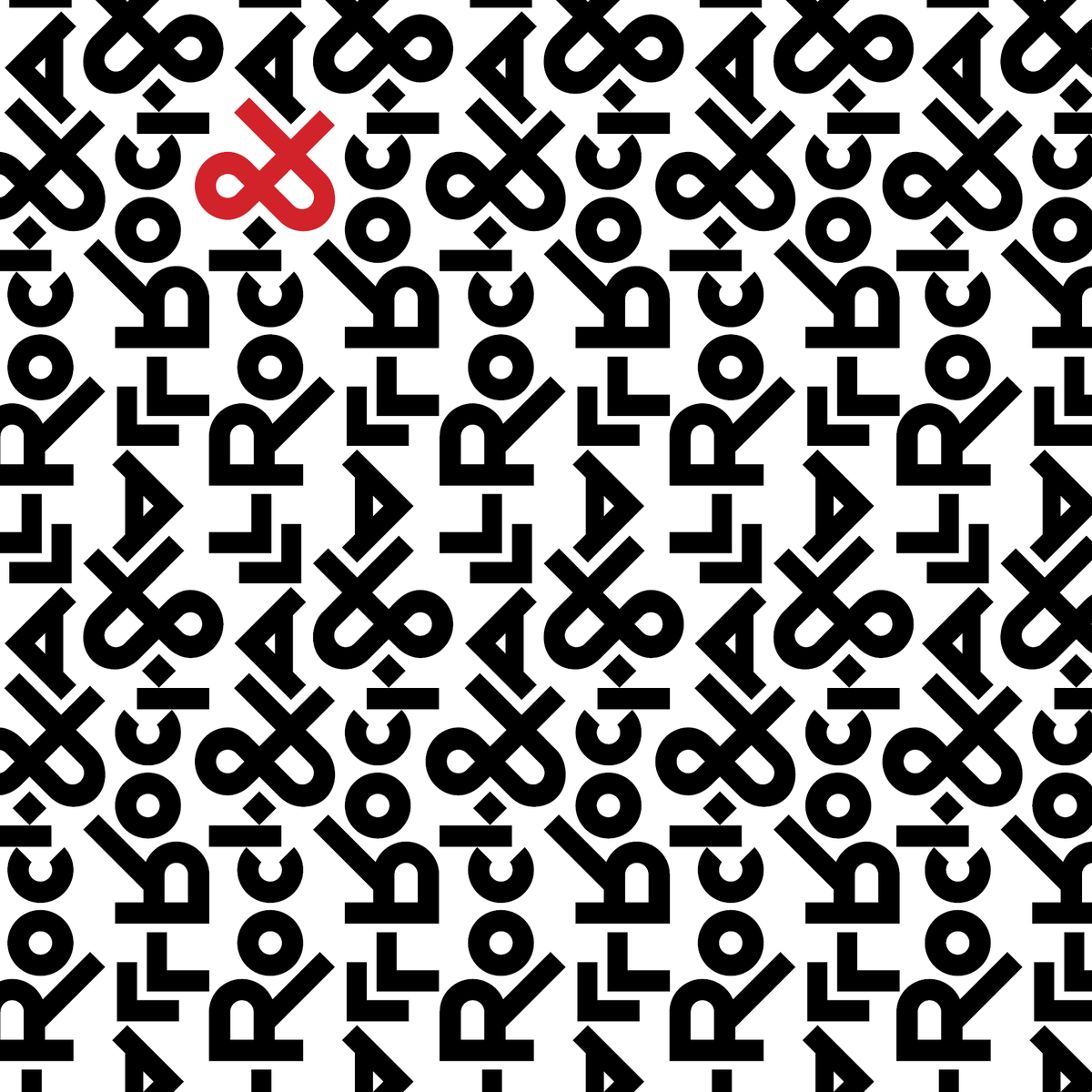
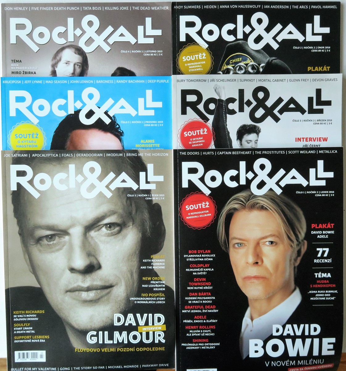
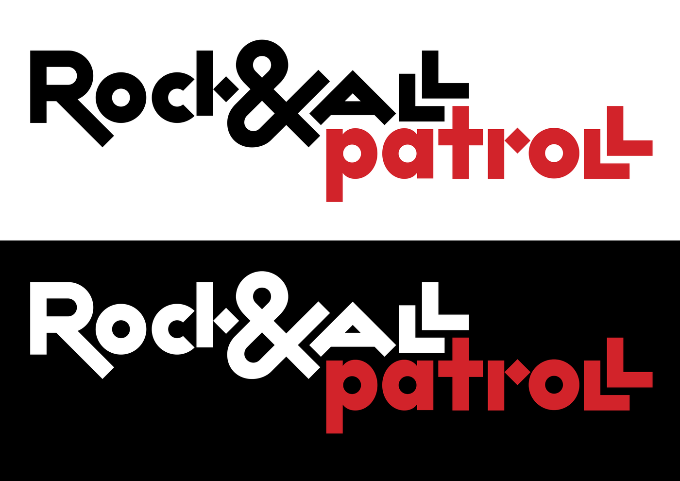
I had to defend this idea a bit as the publishers insisted on more legible "k", "A" stepped out just left and then the final double "L" will nicely stick to it, but in line, not on top of each other... I'm glad I defended my concept. I deliberately left some geometric imperfections in construction in order not to wear out. One colleague argued that it feels too intellectual, which is probable, but above all I wanted something most distinguishing from any magazine logos.